Market Branding
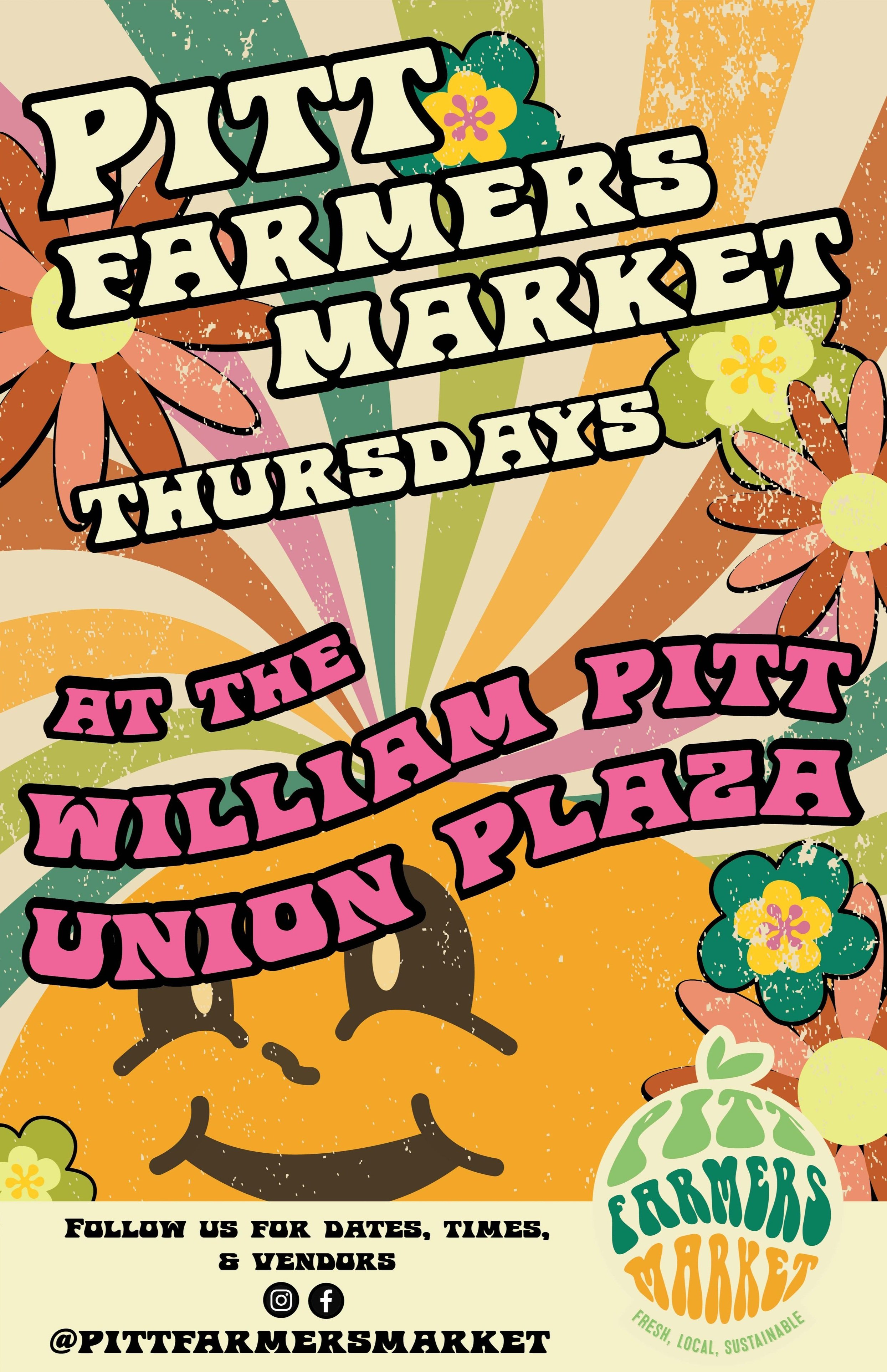
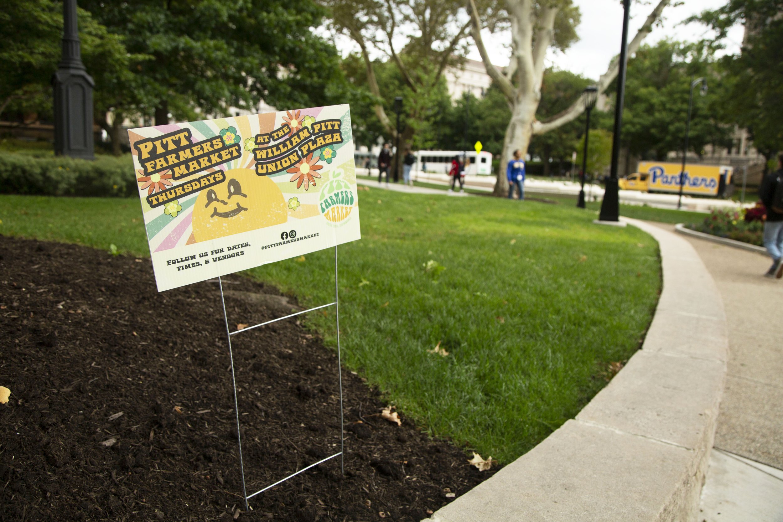
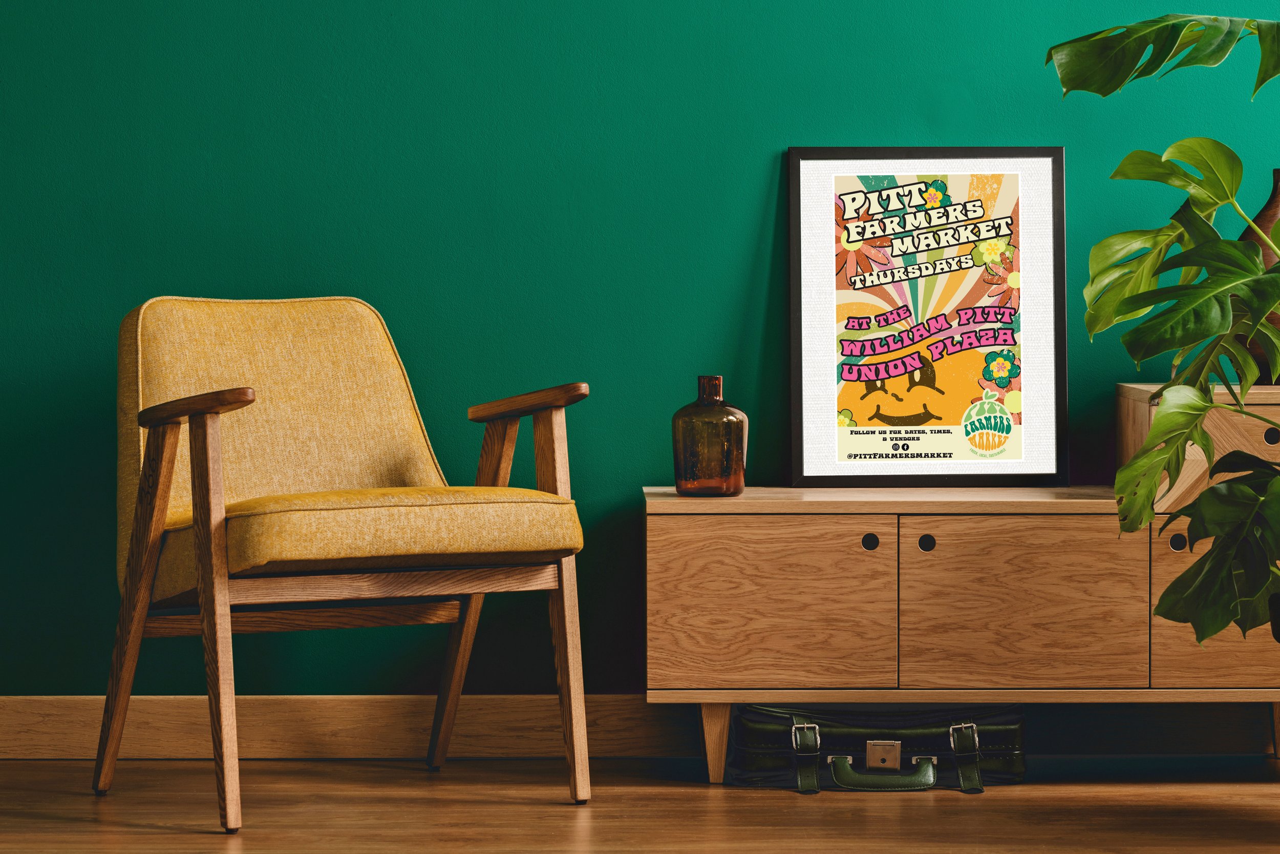
The Problem: A new location for Pitt’s Farmers Market means the perfect time for a branding refresh! I needed to create a new, refreshing brand while being specifically asked by my client to give the branding a retro feel.
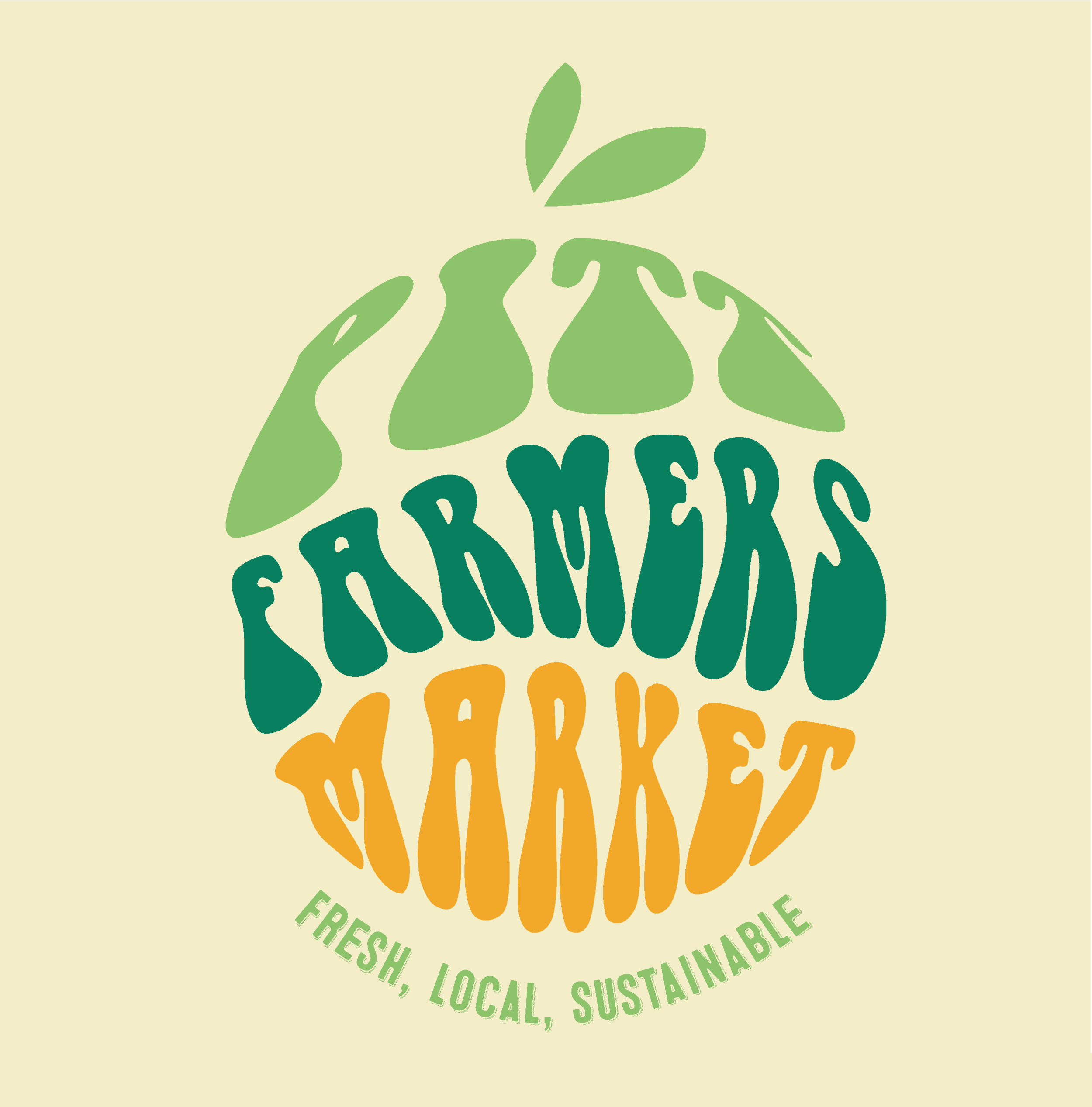
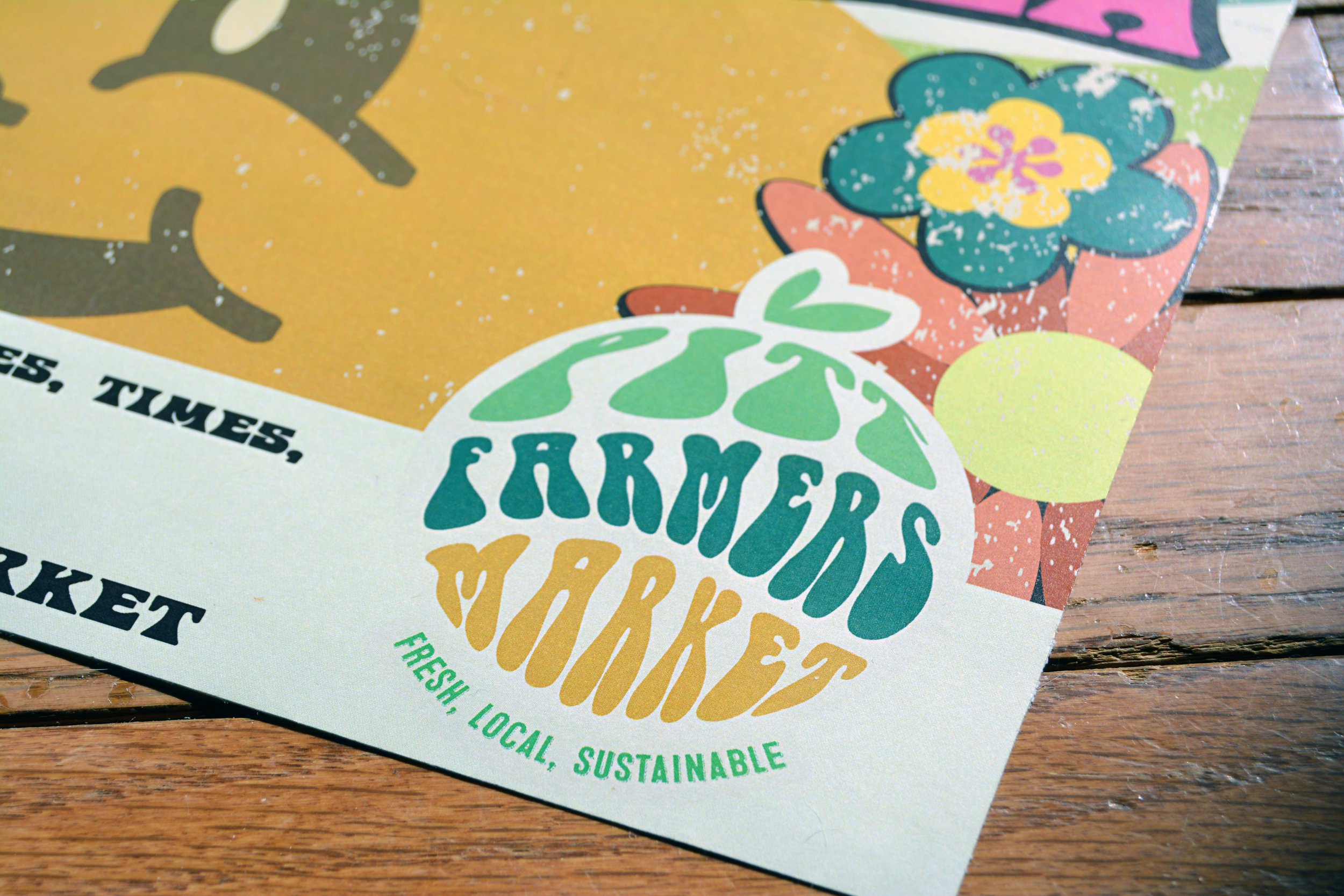
The Solution: The primary objective was to get the community excited about buying local. The color choices are not only cheerful, but they reflect the colors of produce. Additionally, the tan gives the logo an aged look, while the bright green and orange bring a modern kick.
Challenges: Because I was asked to make the logo feel fresh while retro, I had to make it feel nostalgic for people that grew up in the 70’s and make sure it adhered to modern trends in design for college-aged students. Students loved it so much that they asked to make stickers and they sold so well then have begun creating other products with the logo.
Tools used: Illustrator, InDesign
