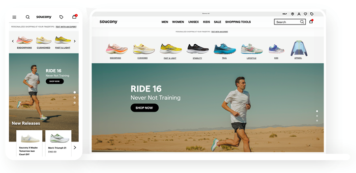
Saucony Homepage


The Problem:
1. How can the homepage provide a variety of products for users with different needs?
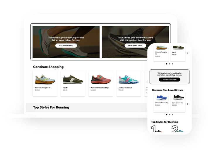
2. How can the homepage encourage a self-service style of product discovery?
3. How can the homepage provide an intuitive, modern shopping experience?
The Solution:
Currently, the average time spent on our homepages is 42 seconds. Additionally, 24% of users bounce from the homepage. With the homepage being one of the most important pages on our sites, we need to alter its format to keep users browsing and catch their interest. Through CIMI research and Netflix inspiration, we dug into ways that we can optimize our homepage experience.
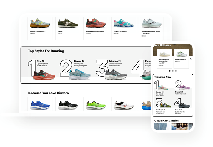
In our design, we generated a two-tiered ranking system, but with a versatile twist! We've created a design with modular content slots that can be moved, altered, and rearranged as you see fit. This means that brands can refresh their sites often without a large lift from development; generating a much longer shelf life as a whole.
We've also tapped into a variety of our existing tools to create a curated and targeted shopping experience for our customers. Looking for ways to incorporate more customer personalization? Use Einstein. Looking for ways to drive heat with certain products? Include a "Trending Now" section.
Strategies:
Taking a deep dive into Netflix, we noticed that it has a lengthy homepage without feeling overwhelming. They accomplish this through a two-tiered ranking system - in theory, this system allows all products to land within the most likely to see area on the site (top left). Currently, few products end up in that real estate, inadvertently making brand stories and products easy to miss
Accessibility:
Saucony’s current branding was used throught the design to meet WCAG guidelines.
Tools Used:
Adobe XD
Full Prototype
