


The Problem: APTEKA, a fine-dining restaurant in Pittsburgh, PA, needs an online experience that will attract more customers and establish their restaurant's branding. Current site: https://aptekapgh.com/
Description: APTEKA supports the local art scene in their branding and restaurant design which needs to be integrated into their website experience. By focusing on the cultural inspiration for their cuisine, I designed a website that is easy to navigate and helps the user understand the restaurant's offerings.
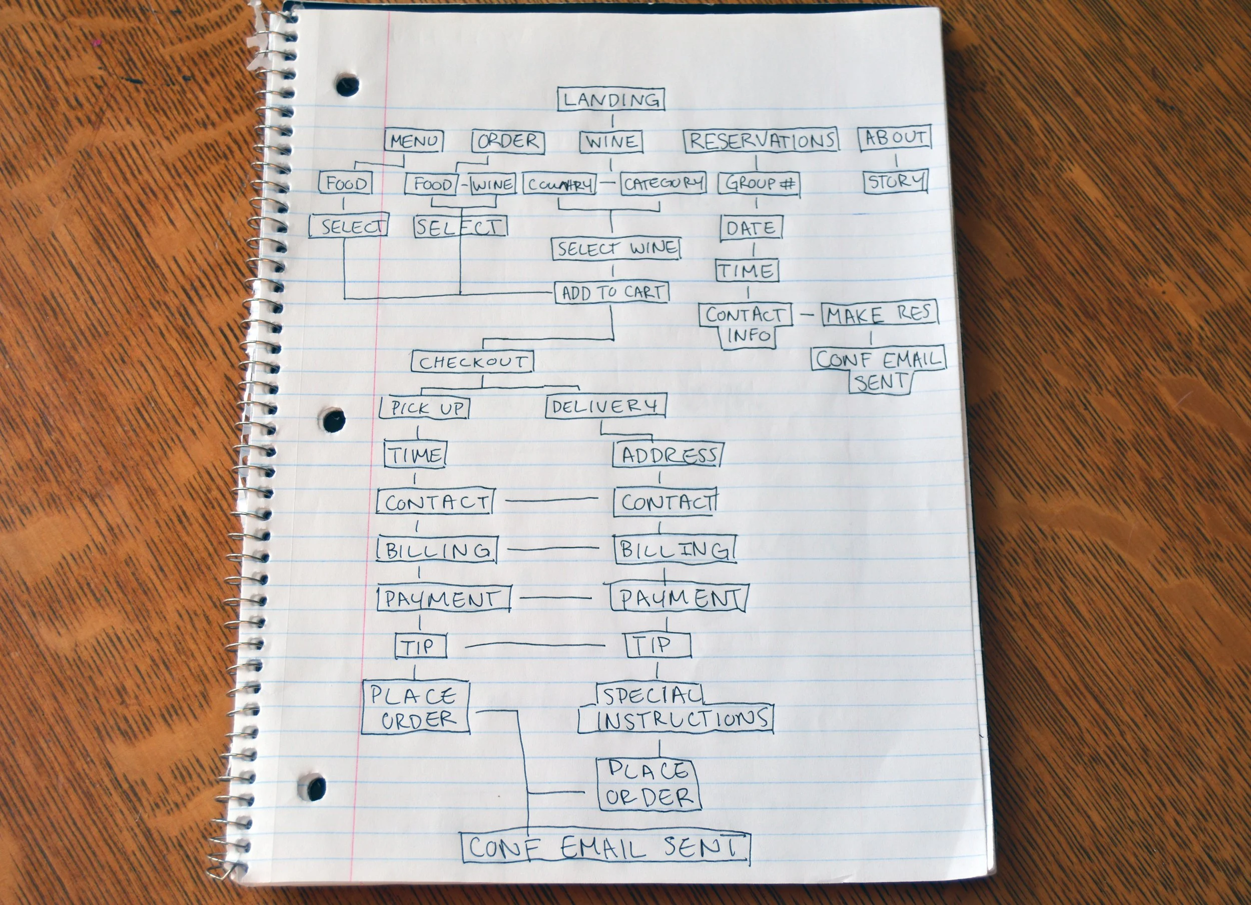
To start, I wanted to better understand the user needs so I created a persona and journey map. Next, I wanted to create the framework for the website, so I made Site Maps to provide information of the pages and the relationship between them. I then created some sketches of the landing page and low fidelity wireframes to gain a visual understanding of the page.
Pain Points: Confusing nav bar (nav bar alters between top and left side), hours are difficult to read, menu text is small, menu is not accessible for visually impaired, wine shop filtering could be cleaner, gallery page is blank and should be just a social link, not enough padding between nav bar and text on reservation page, hours are duplicated.
Accessibility: High color contrast, scored highly on whocanuse.com. Visual hierarchy of text through font sizes and kerning. Buttons have clear and sufficient text. Drop-down lists outlined in black to create contrast.
High Level Timeline: ~ 30 - 40 hrs
Make of the Team: I worked alone on this project.
Key Goal: Design a beautiful, responsive & easy to use website.
Tools Used: Figma, Illustrator
Next Steps: User test and incorporate feedback into design.