


1
2
3
4
5
6
7

Purpose: Create an online experience that helps APTEKA attract more customers for both takeout and sit-down as well as raise brand awareness. This website was for practice and was not created for APTEKA.
Techniques: This magazine was primary created in InDesign with Illustrator and Photoshop elements throughout.
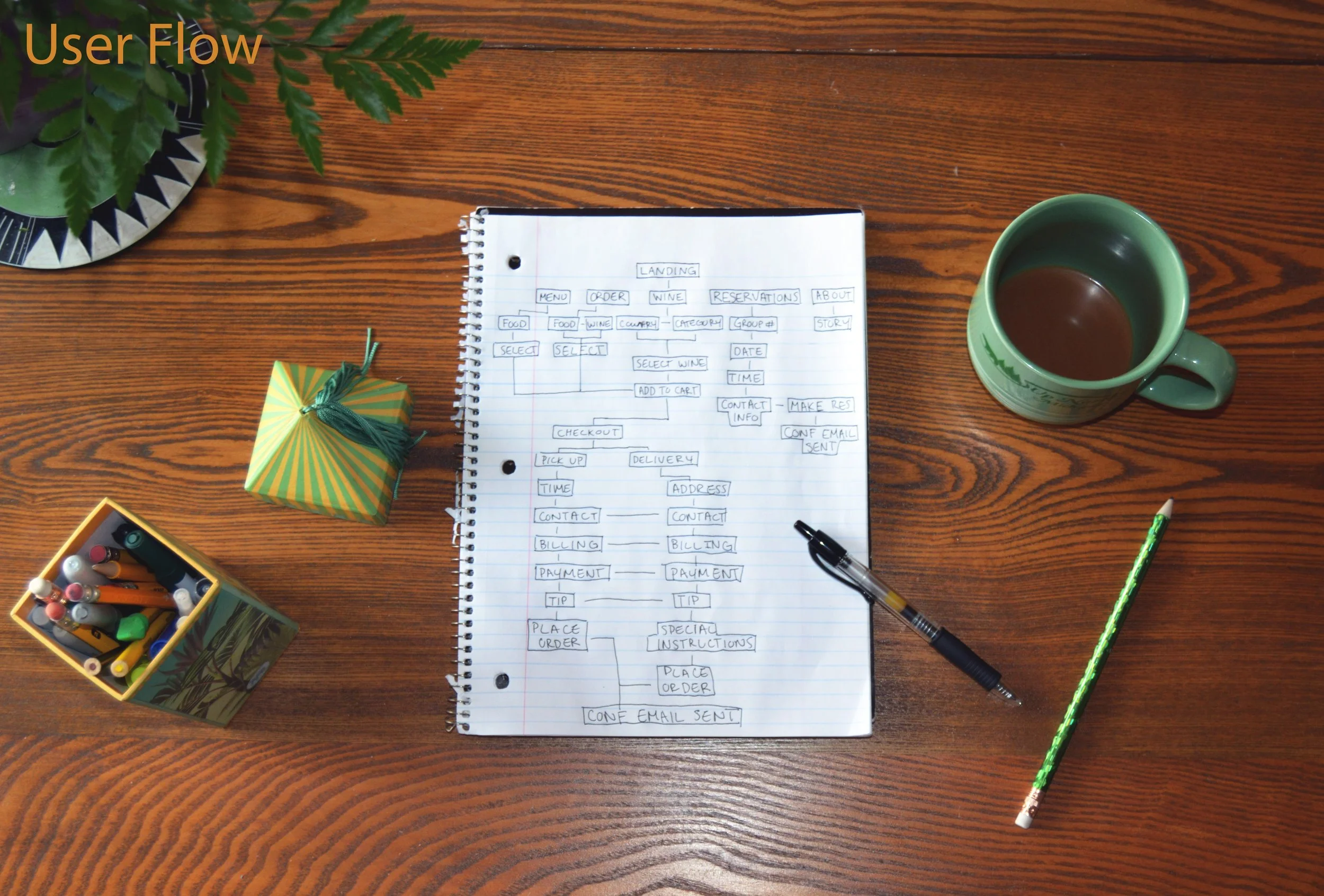
Design Decisions: APTEKA supports the local art scene in their branding and restaurant design, so I incorporated street art as well as a hand-drawn woman on the landing page. The graffiti will attract younger customers while the woman will attract the rest of customers who may be less inclined to abstract art. The colors are used to describe their food; the tan background represents their traditional eastern European meals while the pops of color show the modern and vegetarian spin they put on their food. These colors were also checked for ADA compliance and scored highly. I then consolidated the navigation bar to make the user flow more direct and used a larger san serif font to make it more readable for online and mobile.
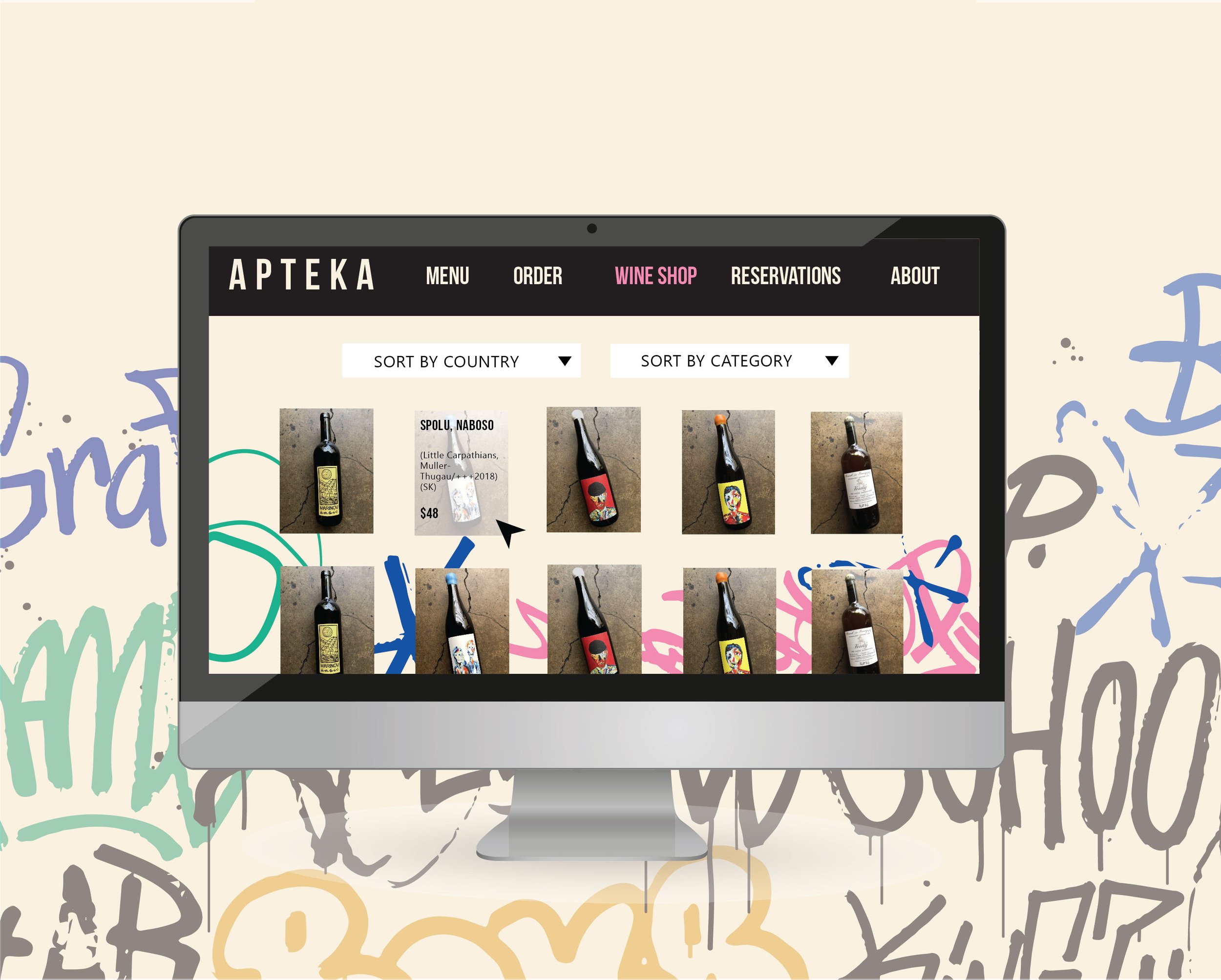
The website shows text when your mouse hovers over the images of the wine. This creates a cleaner look on the page and consolidates space. This translates to mobile through a single and double click; the single click brings up the wine information and the double click brings up the detailed page of the bottle.